
A/118, Gali No-02, Pradhan Gali, Johripur, Delhi 110094
Office Hours: 10:00am-7:00pm
Call Anytime 24/7
Office Address

Services for responsive web design guarantee that a web solution will adapt to the size of the screen it is presented on. Akash Tech Group converts the functionality of your web solution into an intuitive, smoothly running, and highly converting digital experience by employing the mobile-first strategy.
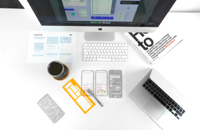
The interface with software on a mobile device is entirely different from that on a desktop computer due to factors including content resizing, touch-screen gestures, and device-specific buttons. Because of this, we approach the mobile and desktop designs for your online solution as related yet distinct entities. Starting with mobile and moving on to desktop design enables us to quickly develop web solutions that are visually identical yet have independent user experiences that are seamless across all devices.
The design team at Akash Tech Group carefully integrates your particular business needs with the most recent trends in responsive website and web portal design. Before the project begins, we have a thorough conversation with you about all of your workflows and business objectives. In this manner, we are able to produce web designs that satisfy your top marketing goals, such as enhanced user engagement, longer stay time, and higher conversion rates.
Early on in the project, we help you visualize the commercial benefits of our responsive website design services. We undertake thorough market studies, business analyses, and user research to give you accurate and trustworthy statistics on the likely outcomes, such as visitor session time, user engagement rate, and conversions.


You can create a responsive design using a variety of tools provided by Google Web Designer. Your document should have responsive page dimensions, at the very least. Using percentages to specify object sizes and placements will also result in a fluid layout.
Websites with responsive web design load more quickly and are simpler to use. Users are more likely to stay on your website since it makes it easy for them to discover the information they need later. Additionally, excellent usability may persuade visitors to return to your website in the future.
Making websites that can adjust to the size of the visitor's viewport is known as responsive web design. No matter how a user accesses a website, the content should render differently based on the device or screen size to give them the best possible experience.
A page automatically rearranges itself based on the detected screen size in responsive web design. In adaptive web design, a layout built especially for the target platform is loaded by the browser.